Tuesday, May 8, 2012

Assignment 20

I am starting my final assignment with no idea where to go. I want to pick a topic where I can make it without risking future job opportunities, so I guess ID theft is my best option. Identity theft occurs when your personal information is stolen and used without your knowledge to commit fraud or other crimes. This is a poster that should have white/black for the logo+portrait. The portrait should be the first thing seen, followed by a slogan and the logo near the bottom.

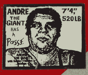
Shepard Fairey is an American contemporary graphic designer who is considered to be one of the most influential street artists. Fairey became involved with art in 1984, when he started to place his drawings on skateboards and T-shirts.
Above are samples of Fairey's work.

The following are inspiration pieces that will influence my work.
The idea of a faceless person will be good for the idea of having your identity stolen.
 
The image of someone holding a credit card will be great for the logo.

Tuesday, April 24, 2012

Creative Process 19

The Candy Shop's logo is going to have to have bright colors. Ted's Hot Wings' logo will definitely have some red in it. Looking at similar logos, there's very few don't. Azul Salon and Spa will have some relaxing blues (Azul), and maybe some light greens.

This logo makes me feel a little relaxed for some reason. Must be the blues used.

This was the logo that made me realize that NO hot wings logo is acceptable without red.

The company name has to be first. Then my name, followed by occupation, as well as address, phone, fax, web site, and email.

Stationary Package

Definition: the printed pieces that a compnay utilizes for communication purposes.

-when establishing a business, it is very important that all communications are well coordinated and tht the message of the organization is presented consistently.
-includes: Business Card, Letterhead, and envelope.

Business Card

-an essential part of a stationary design.
-When you hand someone your business card, they form an immediate opinion about your company.
-Your business card does more than tell people how to find you: it says something about your company- its mission, its goals, its goals.
-Everything from the colors, font, the texture, shade, and gloss of the paper your print on says something about you.

Typically includes:
-logo
-company name
-employee name
-title
-phone number
-fax number
-email address
-company address
-web address

Design tips:
-must be 2"x3.5"
-horizontal or vertical orientation
-check for accuracy
-check for unity... continuity among other pieces.
-typical margins (.25"x.125")

Letterhead

-a printed piece of paper used to send letters, memos, ect

Typically includes:
-Logo
-Company Name
-Company Address
-Phone Number
-Fax Number
-Web Address

Design Tips
-Must be 8.5"x11"
-must be vertical orientation
-must leave room to write the letter, memo, ect- big empty space in the middle.
-check for accuracy
-check for unity

Envelope

-The packaging that contains the letter/form when being mailed. (Standard #10 envelope)

Typically includes:
-Logo
-Company Name
-Company address

Design tips:
-must be 9.5"x4.125"
-Horizontal OR Vertical orientation
-Must leave room for recipient's address and stamp
-check for accuracy
-check for unity, continuity among other pieces.
Thursday, April 19, 2012

#18 Research & Inspiration

Colors for this project may vary. In Focus Photography will need colors that make them look professional, yet creative. A shade of gray and another color might work. St. Henry Hotel will require more elegant colors to show that the experience will be nothing less than luxurious. Gold and a rich color should do the trick. Mimi's Flower Shoppe is something challenging. It will require two bright colors that don't clash, don't blind the viewer, and still look visually appealing.

As for trends, I noticed that modern logotypes often have an image that associates with the product or company, or a unique font that goes along with it. I might do this for In Focus or Mimi's, but St. Henri doesn't need it.


This logo is particularly interesting. The Q is shapes like the surrounding squares, plus it has a cool retro computerized font. These guys must be a technology company and love showing that off.

This is another cool one. Especially with the 'i' as an exclamation point. These guys must be creative.


Friday, April 13, 2012

#17 Research & Inspiration

Research: Pear Corporation can be anything. Something incorporating the fruit and the word "incorporated" should do fine.

Inspiration: The pear has a unique shape.

Industry trends: Because this logo could be for a company in ANY industry, something modern, yet timeless must be accomplished.

Visual Hierarchy: The pear must the the thing seen first, whether in shape or word form.

Thursday, April 12, 2012

Logotype Notes

Logotype 

a graphic mark or emblem used to aid and promote instant public recognition.
-less is more

5 Principals of Effective Logo Design
-simple
-memorable
-timeless
-versitile
-appropriate.

Simple
-makes a logo instantly recogognizable.
-something unexpected and unique without being too overdrawn.

Memorable
-simple yet appropriate.

Timeless
-stand the test of time
-still effective in 10-50 years?

Versatile
-looks good across a variety of media and applications.
-vector format
-is it effective if still printed
   -in one color?
   -in reverse color?
   -postage stamp?
   -as large as a billboard?
-focus on concept and shape.

Appropriate
- logo should be for the appropriate audience.

Four Color Process vs Spot color

Four Color Printing: printing with full color. Also called full color printing. Uses CMYK.
Spot Color: method of specifying and printing colors in which each color is printed with its own ink. Effective when one to three colors is used. Very expensive with more colors. Uses Pantone Matching System.

Choose your color wisely!
-Color plays an important role in logo design.
-It can elicit different feelings and emotions from the audience.
-interpretation of color may vary depending on audience demographics. This should be carefully considered.
-Colors tend to follow trends, like fashion. Vibrant companies may follow trends, but banks and firms may have a more conservative color palette.
-Keep your color palette to two to three colors. It will increase production costs and create a chaotic design.

 Types of Logos

Combination Mark

Definition- logo that utilizes both text and graphics

Iconic/Symbolic

-more abstract.
-memorable.
-instantly recognizable.
-clarity when reproduced in small sizes.
-illustarative in nature either concrete or abstract.

Logotype/Wordmark

-incorporates your brand with a uniquely styled font.

Friday, March 30, 2012

Assignment 16 Creative Process

Inspiration: I found a site with several examples of infographics. Some provided lolz, while others greatly disturbed me (with truth).

Brainstorming: My original thought was to make the graphic flow like a video game (even though that never worked out due to time). But I still managed to creatively stack each "level" on top of each other as if it were like taking cards off a shelf.